


overview
In an era of digital banking, the physical branch experience often feels slow and outdated. Before this project, Access Bank customers relied on manual paper forms for simple transactions, leading to long queues, human error, and a frustrating experience.I led the design of two pivotal solutions: the Biometric POS for core financial transactions and Self-Service Kiosks for other common service requests, fundamentally transforming how customers interact with the bank's physical branches.
This project was about more than just digitizing a form; it was about fundamentally reimagining the customer's relationship with the physical bank.
The Challenge: From Paper Queues to Instant Service
Our primary goal was to transform a slow, manual, and stressful process into a fast, secure, and empowering one. The reliance on paper forms was a legacy system that couldn't scale with the bank's customer-centric vision.

Our high-level goals were to:
Drastically reduce customer wait times for all common in-branch services and transactions.
Empower customers with self-service tools that is intuitive and builds confidence.
Enhance security and eliminate fraud through biometric authentication across critical touchpoints.
Reduce the operational burden on branch staff, allowing them to focus on more complex customer needs.
My Role
Kickoff: Understanding the Friction
Early Insights from Branch Observations:
Frequent Form Errors: Illegible handwriting and incorrect account numbers caused transactions to be rejected, forcing customers to start over.
Staff Overload: Bank tellers were bogged down by repetitive data entry, preventing them from engaging in higher-value customer service.
Customer Anxiety: A lack of immediate feedback left customers unsure if their request was being processed correctly, whether for a cash deposit or an SMS alert setup.
Meet the Users: Personas
From our research, two key user personas emerged, representing the spectrum of customers we needed to serve.
Defining the Core Problem
The initial temptation was to simply digitize the existing paper forms. However, our research showed this would be a superficial fix. The real issue wasn't the paper itself, but the entire manual workflow it created—a process filled with friction, uncertainty, and wasted time for both customers and staff across all in-branch services. This led us to synthesize our findings into a clear problem statement.
Problem Statement
Access Bank customers, from busy professionals to small business owners, need a faster and more reliable way to perform all common in-branch financial transactions and service requests because the current paper-based system causes significant delays, is prone to costly errors, and creates a stressful experience that undermines the trust and efficiency expected of a modern bank.
The "How Might We?" Question
The initial temptation was to simply create a digital version of the paper form. However, our research showed the problem was the entire workflow it represented: a linear, manual process with multiple points of failure.
This led to our core question:
This question became our north star, shifting our focus from simply "digitizing a form" to creating an empowering, comprehensive self-service experience.
Visualizing the Journey: Before and After
To truly grasp the scale of the transformation, I mapped both the old and new user flows.
The Original Manual Process ("The Paper Trail")
The previous journey was a fragmented and frustrating experience, bouncing the customer between self-service and waiting for staff intervention, with multiple opportunities for error.
A diagram of the manual process flow showing a fragmented, multi-step journey between a customer and a bank teller that is prone to errors, long waits, and frustrating loops.
The New Biometric POS & Kiosk Process ("The Digital Experience")
The previous journey was a fragmented and frustrating experience, bouncing the customer between self-service and waiting for staff intervention, with multiple opportunities for error.
A diagram of the new biometric POS and Kiosk process flow showing a streamlined, self-service journey where a customer securely logs in and completes a transaction in a few linear steps with instant system authentication.
From Flow to Function: Wireframing the Experience
With the new user flow defined, the next step was to translate this journey into a tangible screen structure. I created low-fidelity wireframes to establish the core layout, information hierarchy, and functionality for each step. This blueprinting phase allowed us to focus on usability and structure without the distraction of colors or branding.
These wireframes served as the foundation for our interactive prototype, allowing us to test and validate the core structure with users before committing to high-fidelity design.
A key moment in the flow is the final confirmation. The wireframe for the Transaction Summary modal was intentionally designed to build user confidence. Key details like the withdrawal amount were given the most visual weight. Most importantly, the action buttons were differentiated: the primary path ('PROCEED') was designed as a solid, filled button, while the secondary, less common path ('EDIT') was a simple outline. This visual hierarchy guides the user toward success while still providing an easy way to make corrections.
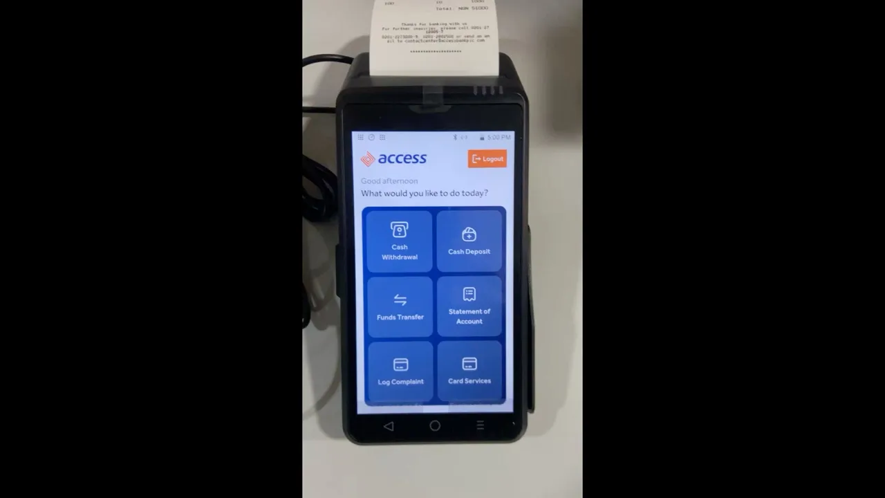
The Design Solution: The ACCESS BANK Biometric POS & KIOSK (access point)
Our solution, designed to be fast enough for Bisi and simple enough for Mr. Adekunle, is a clean, guided experience that prioritizes speed, clarity, and security.
Prototyping and Iterating Based on Feedback
I created an interactive prototype from the wireframes and conducted usability testing with customers matching our personas. A critical finding emerged: users felt anxious when too much information was presented at once. This insight led directly to breaking the process into the final multi-step flow, where each screen has a single, clear purpose:
Enter, Confirm, Authenticate.
Secure Authorization with Biometrics: After all account numbers and amounts are entered, the system requires final authorization to proceed with the transaction. We replaced vulnerable PINs and signatures with fingerprint biometrics, ensuring that the request is unequivocally authorized by the account holder themselves.
The interface provides a simple, focused prompt to guide the user through the scan. The architecture was also designed to support One-Time Passwords (OTP) as a secure fallback, guaranteeing that every customer can complete their transaction with confidence and the highest level of security.
Intuitive Dashboard Access: After an initial biometric login (similar to the POS), the kiosk dashboard presents a wide array of service options, from "Airtime & Data Top-up" to "USSD Deactivation" and "SMS Alert" management.
For sensitive requests like USSD deactivation, the screen presents a clear, step-by-step process, starting with a simple explanation and selection fields to ensure the user makes an informed choice.
Error-Proof Data Entry: The system verifies account numbers in real-time and displays the recipient's name, eliminating the most common source of transaction errors.
Confirmation Before Commitment: A clear summary screen allows the user to review all details before proceeding. The prominent "EDIT" button provides an easy escape route, giving the customer full control.
Security You Can Touch: Fingerprint authentication is faster and significantly more secure than signatures or PINs. Simple, direct instructions demystify the technology.
Instant Reassurance: The final screen provides a clear, unambiguous confirmation, and the option to print a receipt closes the loop, providing a tangible record and peace of mind.
WATCH THE DEMO
Designing for Everyone: Accessibility Considerations
An inclusive design was non-negotiable from the start: So we ensured and implemented the following:
High Contrast: All on-screen text and UI elements were designed to meet WCAG AA standards for readability.
Large Tap Targets: Buttons were designed with a minimum size of 48x48dp, making them easy to tap accurately.
Simple Language: We deliberately avoided technical banking jargon in favor of universally understood terms.
The new Biometric POS and Kiosk devices are being rolled out in phases, and the results, measured 6 months post-launch, were transformative.
0%
Drastic Reduction in Customer Wait Times
The average in-branch transaction time (for withdrawals and transfers) decreased by over 75%, from an average of 18 minutes to under 4 minutes. Similarly, wait times for common service requests (e.g., USSD deactivation) were reduced by over 80%, often completed in under 2 minutes.
0%
Significant Reduction in Operational Costs & Environmental Footprint
Transaction and service request errors resulting from incorrect data entry were virtually eliminated due to real-time validation and biometric authentication, leading to a 98% reduction in related reversals and disputes.
0%
Enhanced Security & Near-Zero Error Rates
The digitization of in-branch services led to a 12% reduction in paper-related operational costs. This figure accounts for the elimination of millions of pre-printed transaction slips and service request forms annually, as well as associated costs for ink, toner, and physical document storage. This shift not only produced direct financial savings but also substantially decreased the bank's environmental footprint, aligning the project's outcome with broader corporate sustainability goals.
0%
Boosted Customer Satisfaction
Customer Satisfaction (CSAT) scores for in-branch services increased by 30% in the first 6 months after launch.
**
Due to company policies, financial data cannot be provided.


Key Challenges & Learnings
Overcoming User Hesitation and Building Trust in a New Technology
Challenge: A significant portion of our user base, particularly older or less tech-savvy customers, showed deep-rooted hesitation towards using a self-service machine for financial transactions. There was a strong preference for face-to-face interaction with tellers and a noticeable apprehension about using biometrics for the first time.
Learning: I learned that technology adoption is as much an emotional challenge as it is a usability one especially in Nigeria. The UI alone cannot solve a deep-seated trust issue. My key takeaway was the need to design a holistic service experience.
We addressed this by working with the operations team to place trained staff near the terminals during the initial rollout to guide and reassure first-time users. This taught me that the most successful products often bridge the digital and physical worlds with a human touch.
Challenge: Initially, some branch staff perceived the new POS and Kiosk systems as a threat or an added burden. Without their active encouragement, customer adoption would suffer.
Learning: I learned that internal users are as critical to a project's success as the end-users. We held workshops with branch staff to understand their workflows and address their concerns directly.
We framed the POS as a tool that would free them from repetitive, low-value tasks to focus on more complex, relationship-building customer needs.
The key takeaway was that successful product design must also include designing the "sell" to internal champions. By making the staff advocates for the new system, we created a positive feedback loop that dramatically accelerated customer adoption.
Challenge: Both POS and Kiosk terminals operate on fixed hardware with non-standard screen sizes and variable processing power. The fingerprint scanners had to function reliably despite public use and varying user conditions.
Learning: This project instilled the discipline of designing for robust constraints. I prioritized simplicity, responsiveness, and clear feedback mechanisms (e.g., "Scan Failed, Please Try Again").
The key takeaway was to constantly ask, "Will this be instant, clear, and reliable on the slowest machine in the busiest branch under real-world conditions?"